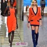
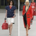
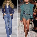
According to the results of Fashion Week in New York, American experts from the Pantone Color Institute named the 10 most fashionable shades of the spring-summer season of 2017. The color scheme includes shades close to natural, reminiscent of lush greenery, sea splashes and tropical fruits.
The top 10 most fashionable colors of the next warm season included:
- ash blue;
- deep yellow;
- dark blue;
- orange red;
- transparent blue;
- light pink;
- lime green;
- purplish pink;
- natural green;
- hazelnut color.
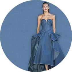
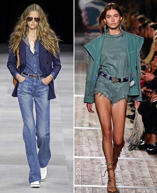
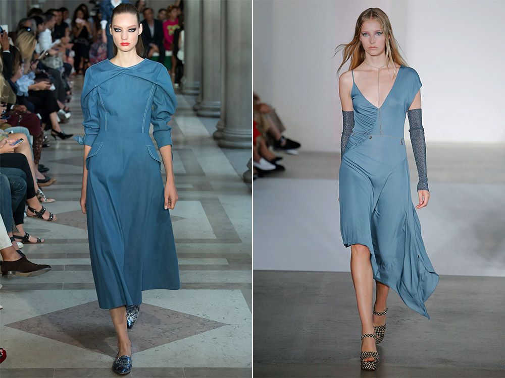
Niagara – Niagara
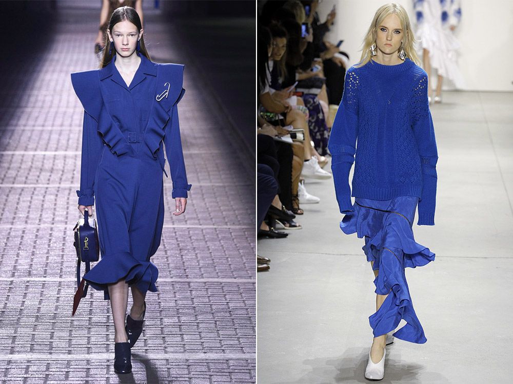
Niagara is the main color of the spring-summer season of 2017. This is a classic blue shade of denim, the color of simplicity, comfort and serenity. Niagara is so versatile that it can be combined with any shades: from bright and rich to pastel and muted, and in the first case it can balance the flashy tones.
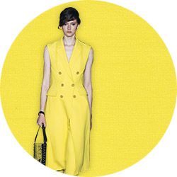
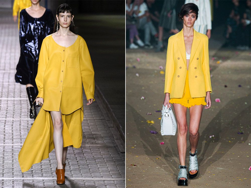
Primrose Yellow – Yellow Primrose
The second dominant color was Primrose Yellow. The shade of the spring flower of primrose, it is also a primrose, gives us warmth, energizes and uplifts. This sunny shade looks incredibly beautiful with a deep Lapis Blue and neutral Hazelnut color..
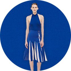
Lapis Blue – Lapis Lazuli
A deep saturated blue color that can only be seen plunging to the bottom of the ocean or in the fashion collections of spring-summer 2017. Lapis lazuli is an intense color that is the opposite of Primrose Yellow, together they look organically, complementing each other. The shade of Lapis Blue is self-sufficient, if desired, it can be diluted with other bright colors that are included in the top most fashionable colors of the season – these are Primrose Yellow and Pink Yarrow.
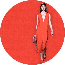
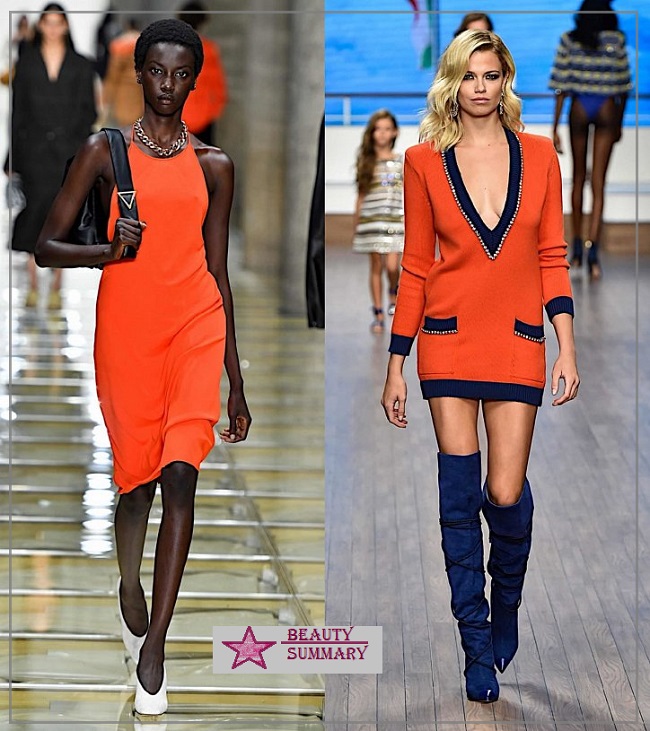
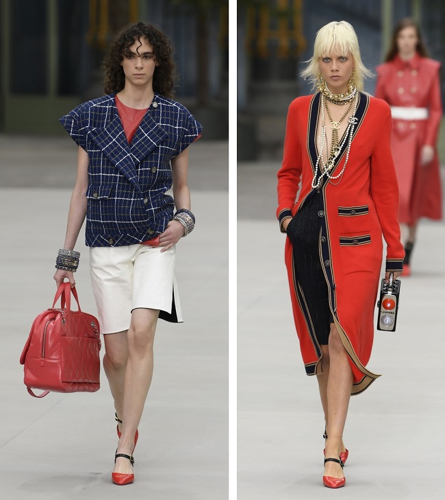
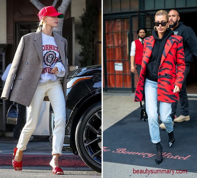
Flame – Flame
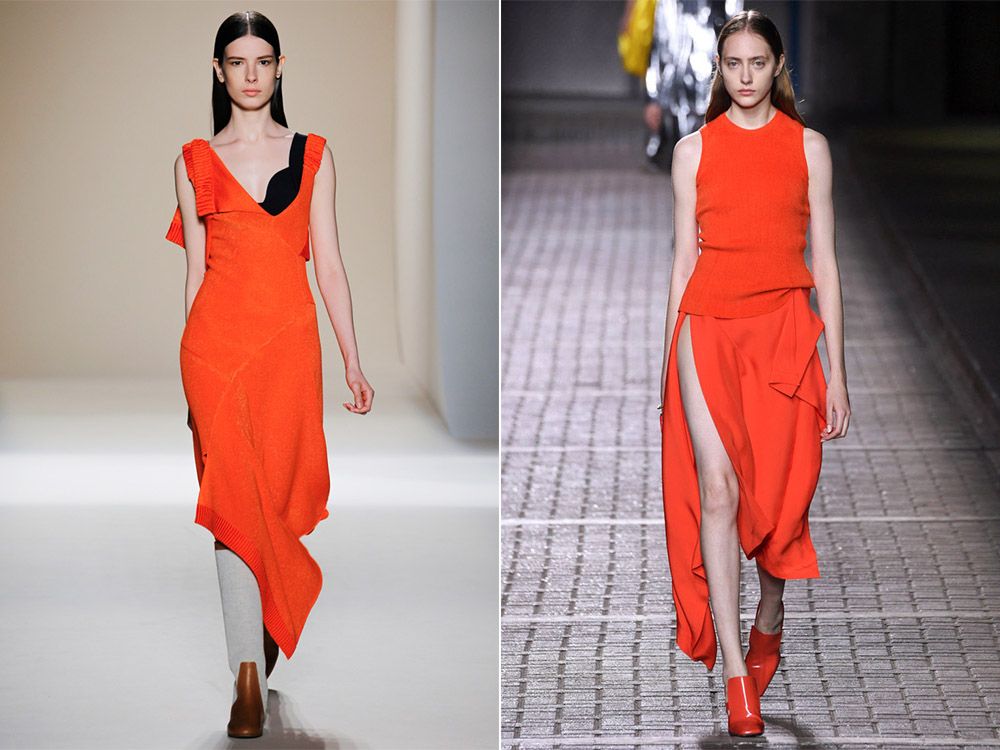
Flame – a burning, fiery red color stands out from the rest of the shades of the fashionable palette of the spring-summer season 2017. Despite the fact that this color is better not to mix with other tones, since it is beautiful on its own, you can dilute it with another shade of one gamut. Flame – a definite favorite of the season.
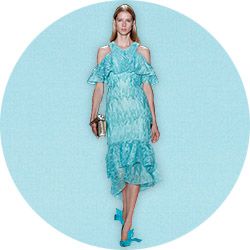
Island Paradise – Paradise Island
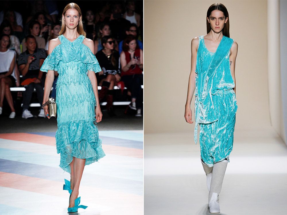
Island Paradise is a refreshing color of sea water, which in nature can only be seen on Paradise Island, where the water against the background of white sand becomes especially azure and transparent. Sheer blue is perfect for spring and summer wardrobe. It looks equally good both on light summer dresses, and on demi-season coats and loose jumpers. Try combining Island Paradise with other trendy colors of the season – pale pink Pale Dogwood or neutral Hazelnut. So his rich undertones will sparkle even more with sky blue highlights.
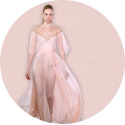
Pale Dogwood – Pale Dogwood
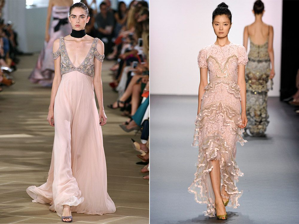
This gentle powdery shade, like a natural blush or a blooming flower, gives lightness and tranquility. It is the color of innocence and purity. Pale dogwood looks especially good on textures such as delicate silk, flying chiffon and delicate cashmere. It is combined with other fashionable shades of the season, for example, with Hazelnut, Island Paradise and Niagara. Light and weightless Pale Dogwood resembles last year’s favorite – Rose Quartz, but it is lighter with a powdery undertone.
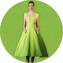
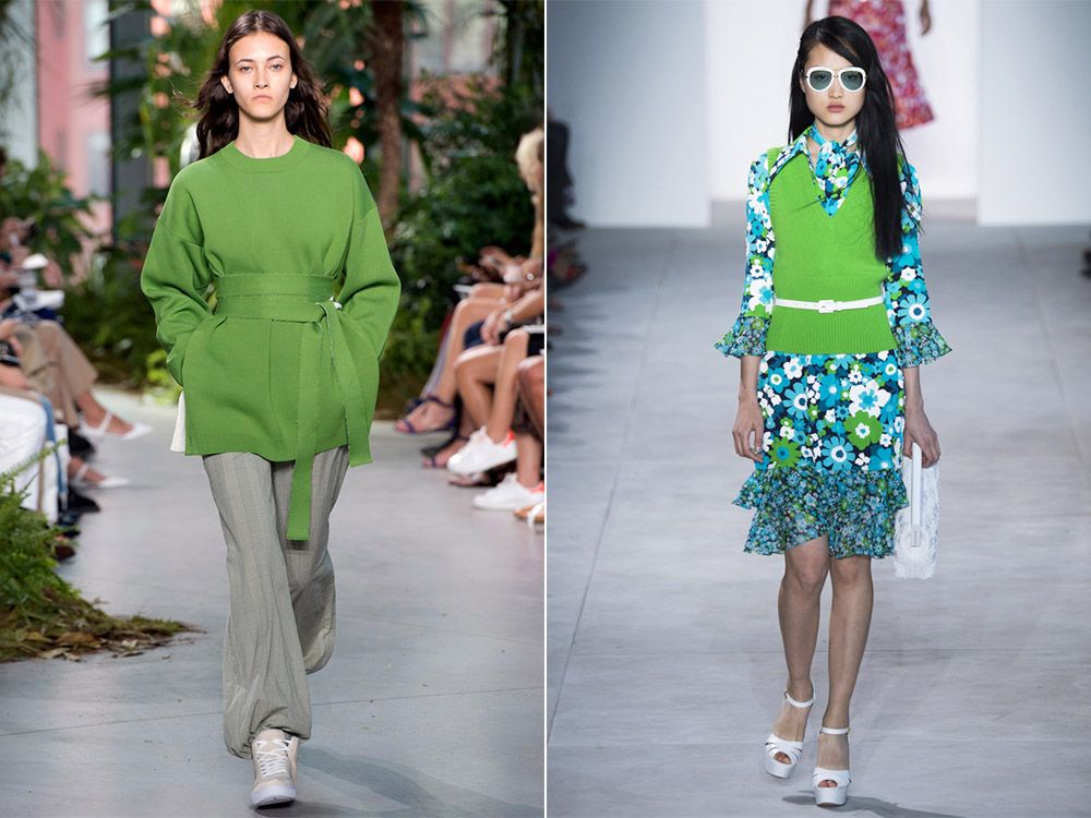
Greenery – Greens
Greenery – a juicy shade of green, reminiscent of fresh spring foliage. The name speaks for itself – Greenery is so “lively” that it just couldn’t miss the list of fashionable spring-summer flowers. This light greenish shade, like the saturated yellow Primrose Yellow, brings us closer to nature, energizes and uplifts. Greenery color is rarely used independently, more often it can be seen as accents or as part of a multicolor background.
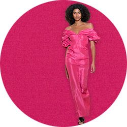
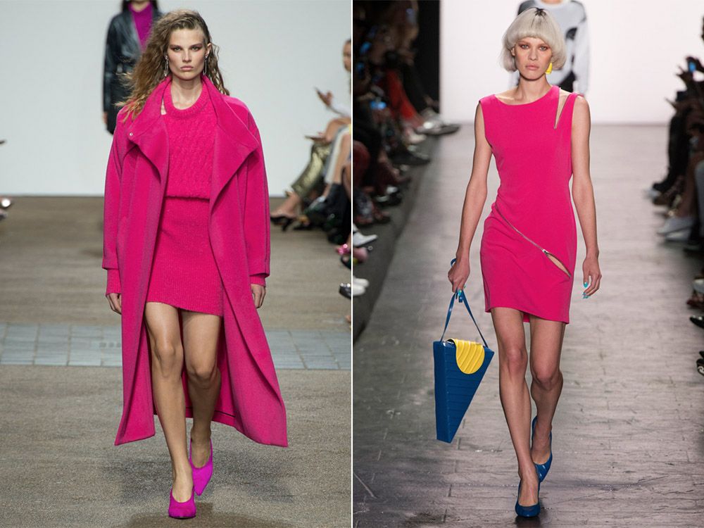
Pink Yarrow – Pink Yarrow
The top 10 most fashionable colors of the spring-summer 2017 season included a bright exotic shade called Pink Yarrow. The vibrant, expressive Pink Yarrow looks best as a key tone. To combine it with other colors, you need a subtle aesthetic flair. The only new purple-pink blends with another trendy hue of the season – with a muted green Kale.
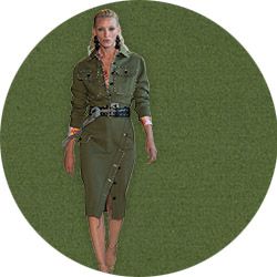
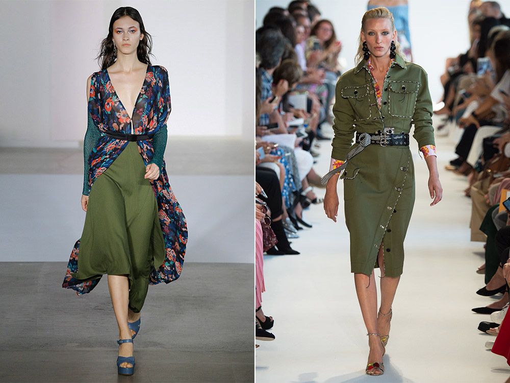
Kale – Kale
Another spring-summer shade of fresh herbs is Kale. Literally translated as Kale Curly Cabbage. This color is both unique and universal, suitable for solo performance, and as a complement to other, more saturated shades. For example, the tropical Pink Yarrow, the scorching red Flame and the vibrant Primrose Yellow.
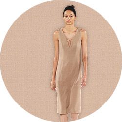
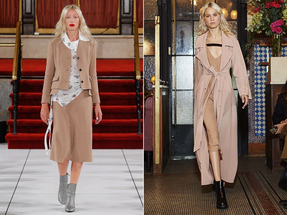
Hazelnut – Hazelnuts
Closes the top 10 fashion colors shade of Hazelnut or Hazelnut. It is part of a line of calm neutral shades, which is suitable for any color type of appearance. Hazelnut is quite light, close to the nude range, resembling the color of coffee with milk. Ideal for discreet classic bows.
These were the 10 most fashionable shades of the season, called by Pantone Institute specialists. Designers advise them to be used not only in the wardrobe, but also in accessories, manicure and makeup. The easiest way to always look stylish is to make a basic wardrobe of neutral colors, fashionable in the spring-summer season of 2017, on the occasion of diluting with bright details and accessories.

