Content
- Incorrect placement of the TV monitor
- Lack of decorative lighting sources
- Doubtful furniture design
- Dark furniture in a low room
- Many reflective surfaces
- Many reflective surfaces
- Scenery without measure
- Pile of furniture
- Blindly following a single style
- A large number of colorful shades
If the kitchen is called the heart of the house, then the living room is his soul, and therefore, it should be exceptionally clean, kind and harmonious. However, often when arranging living rooms, many make the same mistakes, which, in the end, affect the functionality, aesthetics and character of this room. What drawbacks of the living rooms will be discussed, and how to fix them – we will talk further.
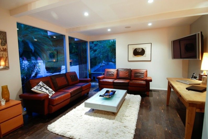
Incorrect placement of the TV monitor
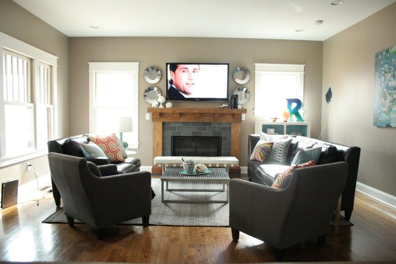
One of the most common mistakes in arranging living rooms is to install a TV or monitor in front of the window, or in the immediate vicinity. As a result, glare interferes with the normal perception of the picture, or tension appears in the eyes when a person looks at the screen installed directly in front of the window.
Correctly
The TV or monitor should be located so that the living room window is on the left or right hand of a person sitting in front of the screen.
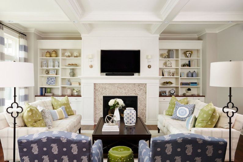
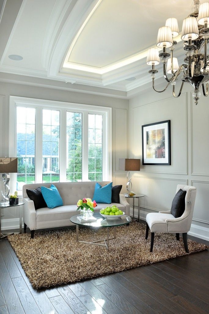
Lack of decorative lighting sources
Even if the room is illuminated well enough through the upper floodlight and spotlights, the lack of additional sources can be a significant drawback, and affect the atmosphere of the living room in the evening. At the end of the day, I want to relax so much, but in a brightly lit living room, this will not be possible.
CORRECTLY
When planning the living room environment, do not forget to provide for the installation of wiring for sconces, and also, get a pair of table lamps for the console. So the room will certainly be cozy and having a good rest in the evening.
Doubtful furniture design
Before you go to the furniture store, it will not be superfluous to familiarize yourself with current trends in subject design. We also recommend looking through thematic magazines, visiting several sites dedicated to interior design, or consulting a designer who will tell you the best models of sofas, armchairs and chests of drawers for your living room.
CORRECTLY
Pay attention to simple furniture with straight lines and a clear silhouette – such items will not go out of fashion for a long time. If you want to experiment, you can purchase furniture with original upholstery, which, if necessary, can be replaced.
Avoid bulky upholstered furniture with lush armrests and atrophied, overly voluminous, backs – these have long lost their relevance.
Dark furniture in a low room
If the living room has low ceilings, everything must be done to make the room easier. But acquiring dark shades of furniture (blue, graphite, chocolate and swamp), you will lose, because the room will become even more squat and cramped.
CORRECTLY
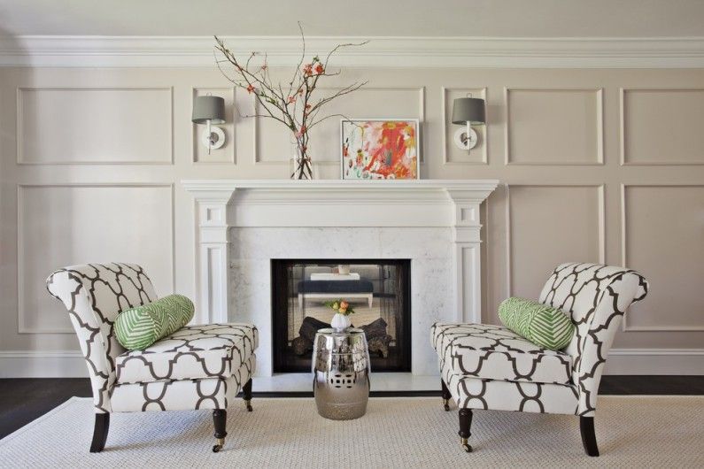
The best solution for a low living room will be the placement of compact sofas, armchairs and neat little tables, always raised to their legs. At the same time, you need to make a choice in favor of neutral light shades of upholstery and the main furniture material.
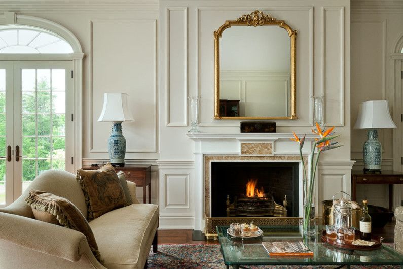
Many reflective surfaces
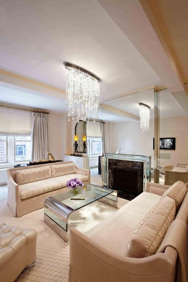
Many of you are very fond of mirrors, therefore, install them everywhere, and sometimes, in an irrepressible amount. This is a genuine mistake for any room, especially if you do not know the basic rules for using reflective surfaces. For example, you should not place a large mirror or mirror panel in a dark room, but also, you do not need to broadcast it in front of a blank wall.
CORRECTLY
In some cases, it would be better if instead of a wall completely covered with mirror tiles, hang one, but a large mirror in a beautiful frame, always opposite a brightly lit window. Thus, the living room will become lighter, lighter, and the decor – more harmonious and comfortable..
Many reflective surfaces
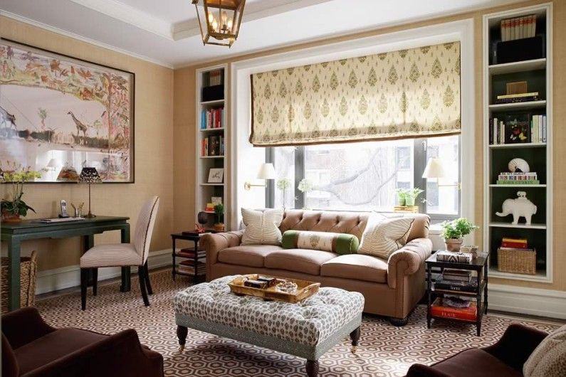
A beautiful window opening or insufficient amount of daylight cannot become a reason for a complete rejection of the textile design of windows. Without curtains gently flowing to the floor, a rare living room looks complete, but fresh and cold.
CORRECTLY
If you are afraid that blackout curtains will block precious natural light streaming from a small window, you can supplement the opening with a Roman lifting mechanism with a light translucent fabric, tulle with a dense assembly or a decorative curtain with a catch, on one side of the opening.
Scenery without measure
A richly decorated living room does not mean: stylish and beautiful, but on the contrary, it can turn out to be tasteless and pathos. It is not advisable to place all the decorative accessories at once in the room, no matter what size it is: paintings, figurines, vases, panels, books and tapestries, awards and diplomas, candelabra, etc..
CORRECTLY
Identify two or three zones that, in your opinion, should be decorated, for example: a fireplace zone, a coffee table in the middle of a sofa group, walls between windows. Choose a pair of bright accessories, complementing them with several neutral objects of different heights and shapes, remember: moderation is important in decorating a living room.
Pile of furniture
If you want to create comfortable conditions in your own living room, it is not necessary to occupy most of its area with furniture, which, as it might seem, will be very appropriate here.
As the practice and experience of designers shows, half of the total number of furniture in living rooms does not find worthy use, blocking the aisles.
CORRECTLY
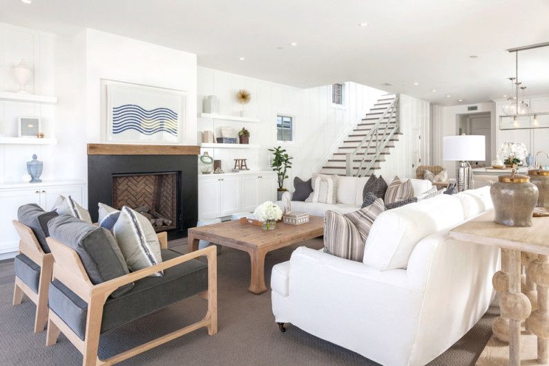
For those who are used to gathering a friendly company in their own living room, we recommend that instead of various items of upholstered furniture (couches, armchairs and pouffes, wide sofas and banquets), place a pair of the same size sofas in the room, complemented by compact mobile tables and chairs with soft backs.
This will create a no less comfortable, but more stylish and collected atmosphere..
Blindly following a single style
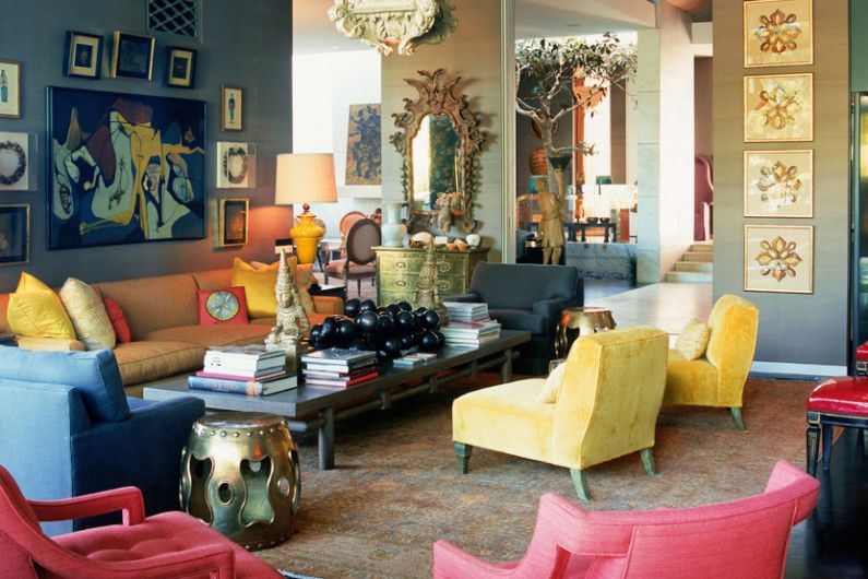
The living room, in which the presence of all the main features of only one direction in design (for example, classicism, or minimalism) is clearly felt, runs the risk of ultimately disappointing its owners with a lack of authenticity, and frank stereotyped. It’s not comfortable to be in a well-defined, pedantic environment, let alone live.
CORRECTLY
If a particular interior style, for example, classic, is especially close to you, it is better to combine it in other living spaces of the living room with other, less pathosy, disposing directions: many-sided eclecticism, characteristic retro, stylish loft or grunge, exquisite image of Parisian apartments.
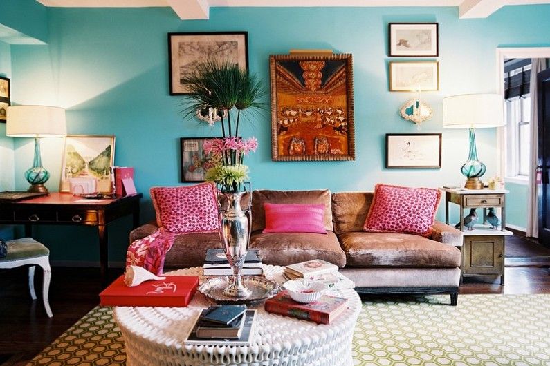
A large number of colorful shades
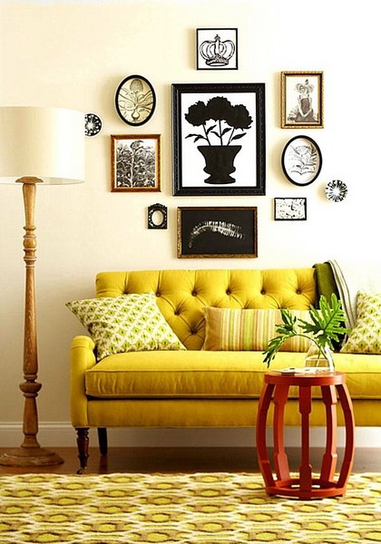
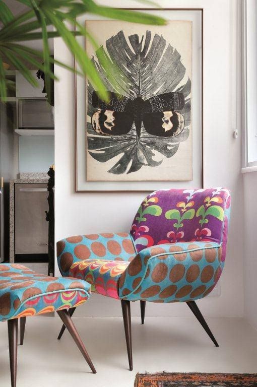
The living room design is too bright – the flip side of the boring monochrome interior. Catchy combinations of colors, the displacement of ornaments and patterns, textures and materials in one space can be fatal in the task of creating a harmonious holistic image. In addition, the interior of the motley room will not be able to successfully adapt to changes in design trends, seasonal holidays and your mood.
CORRECTLY
Choose a light neutral shade for the walls of the living room, and a pair of basic, contrasting or in tone with him, colors, to equip the room. Now you can complement the space with shades (dark or light, plain surfaces or with a pattern), which in a small amount, but will ideally complement the interior.


